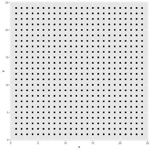
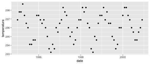
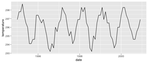
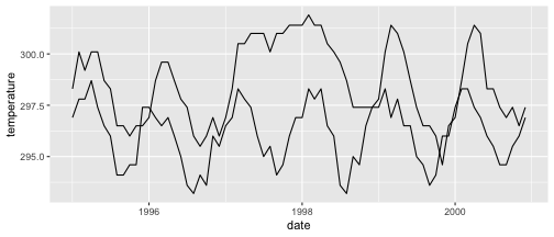
class: center, middle, inverse, title-slide .title[ # Visualizing time ] .author[ ### DS 2020 ] --- # NASA data - `nasa` is a data set in the `GGally` package - it consists of atmospheric measurements across a grid of locations in Middle America ```r data(nasa, package="GGally") head(nasa) ``` ``` ## time y x lat long date cloudhigh cloudlow cloudmid ozone ## 1 1 1 1 -21.2 -113.8000 1995-01-01 0.5 31.0 2.0 260 ## 2 1 1 2 -21.2 -111.2957 1995-01-01 1.5 31.5 2.5 260 ## 3 1 1 3 -21.2 -108.7913 1995-01-01 1.5 32.5 3.5 260 ## 4 1 1 4 -21.2 -106.2870 1995-01-01 1.0 39.0 4.0 258 ## 5 1 1 5 -21.2 -103.7826 1995-01-01 0.5 48.0 4.5 258 ## 6 1 1 6 -21.2 -101.2783 1995-01-01 0.0 50.0 2.5 258 ## pressure surftemp temperature id day month year ## 1 1000 297.4 296.9 1-1 0 1 1995 ## 2 1000 297.4 296.5 2-1 0 1 1995 ## 3 1000 297.4 296.0 3-1 0 1 1995 ## 4 1000 296.9 296.5 4-1 0 1 1995 ## 5 1000 296.5 295.5 5-1 0 1 1995 ## 6 1000 296.5 295.0 6-1 0 1 1995 ``` --- # Quick overview ```r nasa %>% group_by(x, y) %>% tally() %>% head() ``` ``` ## # A tibble: 6 × 3 ## # Groups: x [1] ## x y n ## <int> <int> <int> ## 1 1 1 72 ## 2 1 2 72 ## 3 1 3 72 ## 4 1 4 72 ## 5 1 5 72 ## 6 1 6 72 ``` ```r nasa %>% ggplot(aes(x =x , y = y)) + geom_point() ``` <!-- --> --- # A date variable ```r str(nasa$date) ``` ``` ## POSIXct[1:41472], format: "1995-01-01" "1995-01-01" "1995-01-01" "1995-01-01" "1995-01-01" ... ``` ```r summary(nasa$date) ``` ``` ## Min. 1st Qu. Median ## "1995-01-01 00:00:00" "1996-06-23 12:00:00" "1997-12-16 12:00:00" ## Mean 3rd Qu. Max. ## "1997-12-15 22:40:00" "1999-06-08 12:00:00" "2000-12-01 00:00:00" ``` --- # Time series - for each observational unit we have multiple measurements: ```r nasa %>% filter(x == 1, y == 1) %>% ggplot(aes(x = date, y = temperature)) + geom_point() ``` <!-- --> --- # Time series (2) - for each observational unit we have multiple measurements, - which we connect by a line: ```r nasa %>% filter(x == 1, y == 1) %>% ggplot(aes(x = date, y = temperature)) + geom_line() ``` <!-- --> --- # Time series (3) - for each observational unit we have multiple measurements, - which we connect by a line. - Each observational unit forms a group, we only connect points within a group by a line. ```r nasa %>% filter(x == 1, y %in% c(1, 10)) %>% ggplot(aes(x = date, y = temperature, group=id)) + geom_line() ``` <!-- --> --- class: inverse # Your Turn (6 mins) - Load the `nasa` data from the package `GGally`, - for one location, draw a time line of Ozone over the time frame (`date`). - Plot separate lines for each of the years, i.e. put `month` on the x-axis and `ozone` on the y-axis for the same location. Is there a seasonal pattern apparent? - Pick a location with x in 1:10 and y in 7:10. Plot temperature over time. Comment on the result.