class: center, middle, inverse, title-slide .title[ # Drawing Maps ] .author[ ### DS 2020 ] --- class: middle, inverse, center # Drawing maps --- # Outline - what is a map - maps and map data in ggplot - drawing choropleth maps --- # Maps are ... - ... points in latitude and longitude <!-- --> - that are connected in the 'right' order (determined by order in the data frame) 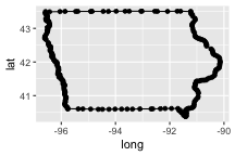<!-- --> --- # Maps ... .pull-left[ - use `group` parameter to distinguish between different regions 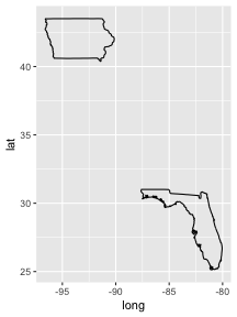<!-- --> ] .pull-right[ - are usually filled in 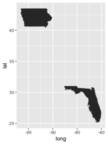<!-- --> ] --- # map data ``` r states <- map_data("state") head(states) ``` ``` ## long lat group order region subregion ## 1 -87.46201 30.38968 1 1 alabama <NA> ## 2 -87.48493 30.37249 1 2 alabama <NA> ## 3 -87.52503 30.37249 1 3 alabama <NA> ## 4 -87.53076 30.33239 1 4 alabama <NA> ## 5 -87.57087 30.32665 1 5 alabama <NA> ## 6 -87.58806 30.32665 1 6 alabama <NA> ``` --- # Maps in code (1) ``` r states %>% ggplot(aes(x = long, y = lat)) + geom_point() ``` 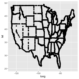<!-- --> --- # Maps in code (2) ``` r states %>% ggplot(aes(x = long, y = lat)) + geom_path(aes(group = group)) ``` 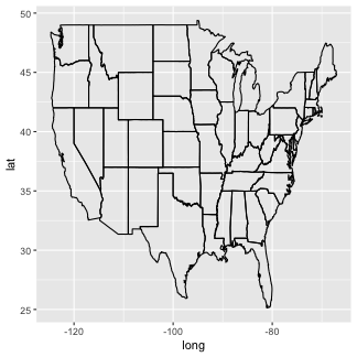<!-- --> --- # Maps in code (3) ``` r states %>% ggplot(aes(x = long, y = lat)) + geom_polygon(aes(group = group)) ``` 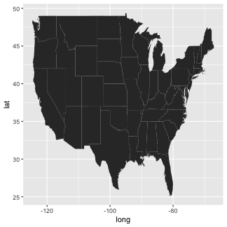<!-- --> --- # Maps in code (4) ``` r states %>% ggplot(aes(x = long, y = lat)) + geom_polygon(aes(group = group, fill=lat)) ``` 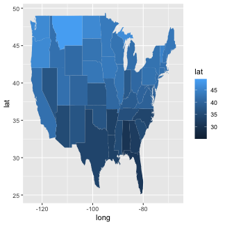<!-- --> --- class: inverse # Your Turn (6 mins) - Use ggplot2 and pull out map data for all US counties: ``` counties <- map_data("county") ``` - Draw a map of counties (polygons and path geom) - Colour all counties called "story" - Advanced: What county names are used often? --- # Choropleth maps - choropleth maps are thematic maps: areas are shaded in proportion to the values of a variable - join datasets: content and map --- # Join content and map Content: ``` r data(fbi, package="classdata") fbi14 <- fbi %>% filter(year == 2014) head(fbi14) ``` ``` ## # A tibble: 6 × 8 ## state state_id state_abbr year population type count violent_crime ## <chr> <int> <chr> <int> <int> <chr> <int> <lgl> ## 1 Alabama 2 AL 2014 4846411 homicide 276 TRUE ## 2 Alabama 2 AL 2014 4846411 rape_legacy 1425 TRUE ## 3 Alabama 2 AL 2014 4846411 rape_revised 2005 TRUE ## 4 Alabama 2 AL 2014 4846411 robbery 4702 TRUE ## 5 Alabama 2 AL 2014 4846411 aggravated_a… 13744 TRUE ## 6 Alabama 2 AL 2014 4846411 burglary 39723 FALSE ``` --- # Join content and map Map: ``` r head(states) ``` ``` ## long lat group order region subregion ## 1 -87.46201 30.38968 1 1 alabama <NA> ## 2 -87.48493 30.37249 1 2 alabama <NA> ## 3 -87.52503 30.37249 1 3 alabama <NA> ## 4 -87.53076 30.33239 1 4 alabama <NA> ## 5 -87.57087 30.32665 1 5 alabama <NA> ## 6 -87.58806 30.32665 1 6 alabama <NA> ``` --- # Prepare for join - combine fbi and states by state name, but we need to make the spelling the same - for simplification, introduce new variable with all lower case letters - generally, content data is more important, but we will see missing states on the map: `anti_join` ``` r fbi14$region <- tolower(fbi14$state) nomatch1 <- fbi14 %>% anti_join(states, by="region") # States for which we do not have map data unique(nomatch1$state) ``` ``` ## [1] "Alaska" "Hawaii" "Puerto Rico" ``` ``` r nomatch2 <- states %>% anti_join(fbi14, by="region") # States for which we do not have crime data unique(nomatch2$state) ``` ``` ## NULL ``` --- # Join and Map ``` r fbi.map <- fbi14 %>% left_join(states, by="region") ``` ``` ## Warning in left_join(., states, by = "region"): Detected an unexpected many-to-many relationship between `x` and `y`. ## ℹ Row 1 of `x` matches multiple rows in `y`. ## ℹ Row 1 of `y` matches multiple rows in `x`. ## ℹ If a many-to-many relationship is expected, set `relationship = ## "many-to-many"` to silence this warning. ``` ``` r fbi.map %>% filter(type=="burglary") %>% ggplot(aes(x = long, y = lat, fill=count/population*100000)) + geom_polygon(aes(group=group)) ``` 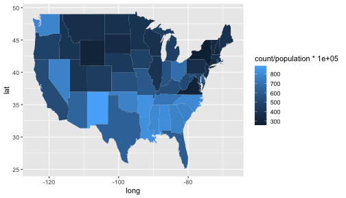<!-- --> --- class: inverse # Your Turn - Draw a choropleth map of the rate of motor vehicle thefts in 2020 across the US. - `scale_fill_gradient2` allows you to set a color scheme with two main colors. Read up on it and change the scheme in the first choropleth map. Make the color change at the median rate of motor vehicle thefts - the package `ggthemes` provides a variety of themes that make charts look like from specific sources (e.g `theme_excel`, `theme_wsj`, `theme_economist` ...) Try adding the theme `theme_map()` to the above map. --- # Key Takeaways - maps are just data: `long`, `lat`, and `group` - ggplot maps follow the same structure: points → paths → polygons - choropleth maps = map data + joined dataset - always check joins before mapping: `anti_join()`